
Okai Website
2023
Graphic Design, Web Design, UI/UX
Insert Stereotype Here...
2014
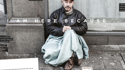
Insert stereotype here...
We often walk past people who are begging or are sitting on the street and we assume their life story. We possibly suggest that by some fault of their own, they are on the street.
We must understand that we really don't know anyones story until we take the time to listen. I illuminated the stories of these 3 homeless men because the stories they told were not unbelievably crazy stories and any one person could relate in some way to any of the three stories.
Homelessness could be a reality for any one of us, and we must not ignore or neglect those on the street from society.
Lightboxes were made to enable the photographs to be well lit and the issue to be illuminated.
Graphic Design, Photography, Typography
Wedding Childcare Brochure
2020
Graphic Design

Activity Delivered Logo
2019
Branding, Graphic Design

King's Church Logo
2019
Branding, Graphic Design

Innovation IT
2019
Branding, Graphic Design, Web Design
Path of Disciples
2019
Branding, Graphic Design
Go Skip Compare
2019
Web Design, Graphic Design

Fresh Car Valeting
2019
Graphic Design

New Ground Youth logo
2019
Branding, Graphic Design

Church Graphics 2016
2016
A collection of pieces of design for King's Church Edinburgh in 2016
Graphic Design

Glenwick Logo
2016
A logo used for an Investment company called Glenwick PLC.
Branding, Graphic Design

Camp Westminster Brochure
2015
A brochure for Camp Westminster on Higgins Lake in Michigan, USA. It includes their 2015 summer program.
Editorial Design, Graphic Design
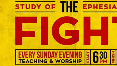
Church Graphics 2015
2015
A variety of designs for King's Church Edinburgh during 2015
Advertising, Creative Direction, Graphic Design
ZLeather Works Logo Design
2015
Logo design for a leather company
www.zleatherworks.com
Branding, Graphic Design, Icon Design
Novella
2014
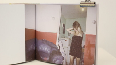
I gave two disposable cameras out to 2 homeless men and asked them to document their life through a lens. I chose not to suggest what they could take photographs of, and in turn allowing them to show me what they wanted to from their life.
The results are displayed in a simple way in the pages of two books. The photographs also have accompanying quotes that I have gained from informal interviews with them.
When the two of them saw the books, they signed the cover as a seal of approval.
Graphic Design, Photography, Typography
Blankets
2014
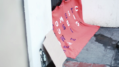
A film telling the silent stories of homeless people who live on the street.
Directing, Film, Street Art

Understand
2014
Personal photography of homeless people alongside a story of their life. The typography is initially misunderstood but once it is observed for a longer time, the type becomes legible.
When a homeless person is seen on the street, the story of the homeless person is unknown, but we can easily judge them. The typography reflects this idea.
The use of glyphs in the typography was because of the variety of people that I met on the street, who were from a number of countries across the world.
Graphic Design, Photography